
Tuesday 11 May 2010


Monday 29 March 2010
question 7
Looking back at your preliminary task (the school magazine task), what do you feel you have learnt in the progression from it to full product ?
Looking back even though i enjoyed my final result of my school magazine, i much more preffered making the music magazine because the style of the magazines were different and after making the school magazine, i knew how to work photoshop better making me be able to do better effects.


The difference between the two task was i rushed the preliminary task , i mainly just added text and took photos.This was wrong because to make a succesful magazine you have to take care and time to get it perfect for consumer, so when making Faze i took more time with my photoshoots ,which took me three different Shoots to get the right images.For my music magazine i had to look at existing products to see what works in the publication industry.
Sunday 28 March 2010
question 6
What have you learnt about technologies from the process of constructing this product?


To take my photos for my magazine at first i used a normal samsung digital camera to take the photos, what i found were the images were not crisp where the camera was hand held , so my handy must have been shaking.I then used my friends sony digital S.L.R camera using his tripod aswell the result of this was the images were much better and the camera had smart technology to adjust focus just before the picture gets taken.
 Adobe Photoshop is the application of image editing techniques to photographs in order to create an illusion or deception(in contrast to mere enhancement or correction).To create my magazine i used this software.
At first when i was doing my preliminary task i found it hard to use photoshop, but after a period of time i learnt how to manipulate images and use the layers.To learn how to do this i used videos on youtube , where people posted all different effects to do. It allowed me to input text to my magazine ,giving me the choice to use certain effects like drop shadow which you will see in my contents page .The best manipulation i did for my magazine was putting the hand over the models eye, to do this i used the clone stamp, first cloning the eye then painting it over on to the models hand.
Below is an example of photoshop manipulation with me using the clone stamp.


This website gave me access to a database of fonts , which i would then use for my magazine .I found it easy to use and download because the website catergorised their fonts in to style , making it easy for me to search for the right font.

I also used this interactive service to display all my work.It has been used to show how i have created my end product and to look at other magazines for research.


To take my photos for my magazine at first i used a normal samsung digital camera to take the photos, what i found were the images were not crisp where the camera was hand held , so my handy must have been shaking.I then used my friends sony digital S.L.R camera using his tripod aswell the result of this was the images were much better and the camera had smart technology to adjust focus just before the picture gets taken.
 Adobe Photoshop is the application of image editing techniques to photographs in order to create an illusion or deception(in contrast to mere enhancement or correction).To create my magazine i used this software.
At first when i was doing my preliminary task i found it hard to use photoshop, but after a period of time i learnt how to manipulate images and use the layers.To learn how to do this i used videos on youtube , where people posted all different effects to do. It allowed me to input text to my magazine ,giving me the choice to use certain effects like drop shadow which you will see in my contents page .The best manipulation i did for my magazine was putting the hand over the models eye, to do this i used the clone stamp, first cloning the eye then painting it over on to the models hand.
Below is an example of photoshop manipulation with me using the clone stamp.

This website gave me access to a database of fonts , which i would then use for my magazine .I found it easy to use and download because the website catergorised their fonts in to style , making it easy for me to search for the right font.

I also used this interactive service to display all my work.It has been used to show how i have created my end product and to look at other magazines for research.
question 5
How did you attract/address your audience?

As my magazine is indie rock , its main competition would be NME which is a well established magazine in the market already.However i have two things that the magazine wont be able to compete with.
My magazine is aimed at both sexes giving NME readers a choice to pick my magazine instead.NME mainly targets men so because my magazine equally targets both genders , Faze would provide more reading material for girls then what they would get in NME.
Another advantage i could have to attract my audience is the fact my magazine will be brand new compared to NME which first issue was published 7th March 1952, my audience might pick my magazine over NME , because they are ready for a new brand, they could be getting bored of the style brand of NME.

The double page spread attracts the reader with the quote "it's important to choose what makes you happy" . It allows the audience to see what the article is about before reading it. If they enjoy the quote, it will encourage them to read the rest of the article.The photo sets the mode of address which is serious , the artist is focused on reader with serious facial expression drawing them in to the article and showing them a glimpse of the content.
question 4
Who would be the audience for your media product?
The target audience of my magazine are males and females aged 16-25.I want a unisex audience , to get this my magazine would have both male and female artists featured in the magazine and i would make the magazine more versatile by including articles, which both genders would like.I also used a basic colour scheme , and chose to not use stereotypical colours for a specific gender e.g pink for females.The audience for my magazine are indie style and to make my product fit them ,i have included gigs, style and live music references.I mainly listen to this style of music and because i am in the age group of my taget audience i feel i would be able to relate the magazine to the consumer.
In popular music, independent music, often shortened to indie music or "indie", is a term used to describe independence from major commercial record labels and an autonomous, do it yourself approach to recording and publishing.

This is the style my audience will wear and like to see in the magazine.Smart casual look with the blazer ,tie and skinny jeans or the check shirt and ray bans retro glasses.
Socio economic groups

The typical Faze reader would be;
A male or female who like to dress indie,even though they havent got a lot of money , they would care about their appearance potraying a smart look.They are socially aware of the top bands (using magazine to check this ) liking to keep uptodate with the latest trends.They would purchase their clothes from vintage shops, always in search for a bargain, however appreciate high street clothes from Urban Outfitters , zara and Topshop.Their main hobby would be going to gigs or festivals enjoying them with groups of friends.
A male or female who like to dress indie,even though they havent got a lot of money , they would care about their appearance potraying a smart look.They are socially aware of the top bands (using magazine to check this ) liking to keep uptodate with the latest trends.They would purchase their clothes from vintage shops, always in search for a bargain, however appreciate high street clothes from Urban Outfitters , zara and Topshop.Their main hobby would be going to gigs or festivals enjoying them with groups of friends.
Question 4
Who would be the audience for your media product?
The target audience of my magazine are males and female aged 16 - mid 20s .I wanted to have a unisex audience as this would provide a bigger audience to sell to and make my magazine more versatile.Even though my magazine issue does'nt have a photo of any girls , in other issues there will be to make it unisex.The colour scheme and layout i tried to keep basic and not use a specific colour for a certain sex, This is so i would'nt use any stereotypical colours to favour a certain sex e.g pink .My audience will be indie and be interested to read about gigs,fashion and their favourite groups.
In popular music, independent music, often shortened to indie music or "indie", is a term used to describe independence from major commercial record labels and an autonomous, do it yourself approach to recording and publishing.The music i mainly listen to is indie music so i feel i can relate to my audience by using the conventions fo my magazine.
The audience are known for being associated with the music industry,They dress in mainly urban colours making a relaxed look.The sort of shops they would go to get their clothes are ;vintage shops,Topshop/Topman, Urban Outfitters etc .They genrally dress quite smart E.g blazer and skinny jeans , this is how i dressed my model on front cover to vrelate to my audience.
Tuesday 23 March 2010
question 3
What kind of media institution might distribute your media product and why?


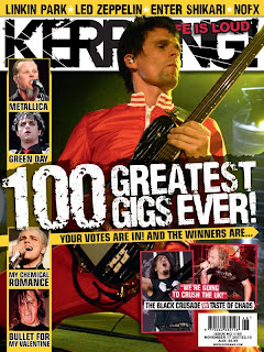
I think bauer publications should publish my magazine if it was made into a professional magazine.Bauer publications brought the large publications firm Emap.This publication company already produces popular titles like Kerrang,Mojo and Q.Except for Kerrang, the company targets their magazine at a higher class of people.

I believe there is a gap in Bauer's company because my magazine targets another set of people, My magazine would provide Bauer with a bigger range of magazines making it more known and recognised by a wide range of people.
Monday 22 March 2010
Question 2
Question 2
How does your media product represent particular social groups ?


Comparison
The posture in both photos are upright showing authority and confidence ,by putting the hand over the eye shows a split personality in the model , this almost represents the content of the article. The hair style are both an indie look representing their music genre. The stances of the photos are different in the sense , my model has a stance which is straight at the consumer , showing attention is on the reader ,unlike Brandon Flowers stance which is at an angle showing
The direct gaze of the model will appeal to the audience by drawing them in and catching their attention,i based my front covers model pose from the photo of Hayley Williams below, i like this image because it is dramatic showing personality.


The contents page of my magazine assumes the audience is interested in all the aspects of the music industry. This is shown by the band index ( the white column) and also by the close up of a lead singer of a band, showing they want to know what the singers up to.
The what's inside column shows the consumer what bands they can follow in the music industry. This would appeal to the younger consumers of my target audience because they are more likely to have time to follow their favorite bands or artists.

My Article is about how my Artist (Jason White) has been in the industry for a while,the story talks about his new albulm and how he and his band dont like the paparazzi .This article would allow any fans of this artist to follow him, this allows them to know any major things happening in the artists life, the will make the bond between the reader and the artist stronger and more personal.
Tuesday 16 March 2010
question 1

Question 1
In what way does your media product use,develop or challenge forms and conventions of real media products ?

Similar to Q magazine front cover,my magazine also uses the same conventions pointed out. As you can see there is a large masthead that dominates the front cover which makes it obvious to the potential reader what magazine they are looking at.

The cover lines used in the front cover of faze magazine acts as a preview for the potential subscriber.It highlights the main articles while advertising them,these cover lines encourage the consumer to buy the magazine.
The direct gaze of the model will appeal to the audience by drawing them in and catching their attention,i based my front covers model pose from the photo of Hayley Williams below, i like this image because it is dramatic showing personality.
Conventions change on the contents page of a magazine. These include a clear layout of the lists on the pages, with the numbers showing each page.On average, a contents page will have a picture on it, as a preview to what information is going to be received while reading the magazine.

My contents page uses the conventions of a top music magazine ,because i have tried to incorporate things from music magazine that would be competition like NME Magazine.The layout of the page is consistent with the front cover sharing similar text and colours.This is to reflect the genre of my magazine .The layout is similar to NME because it uses a very effective black and white scheme with a bold title using the font of the masthead.

Thursday 4 March 2010
double page spread
The two double page spreads below were for me to practice to see how i would continue my magazine style and how i would layout my double page.
“Its important to choose what makes you happy”
The faith are a band known for their rebellious antics towards the media refusing to give interviews or photo shoots and stick the finger up to the paps.But after a few years in the business Jason White the mystery front man of the indie/alternative band The Faith reveals to Faze how he made the right choice in life.
q.How are things in the Faith camp ?
Jason White(lead vocal/guitarist):”they are very good, our band are probably the closest we have ever been and even after four years together we are still deeply immersed in each others lives.Its great to love a group of people and know they feel the same way about you. I think people have a misconception of our group because we try to keep our selves hidden from the media, people think we are unhappy people when we are actually some of the silliest jokers out there.”
q.Your second album (belief) is currently top 10 in the download chart ,are you proud of this achievement?
“Well course I am proud of how far our bands come from doing gigs in bars to performing at places like 02 Brixton academy , but the achievement for me was making music my living, nothing is better then getting paid to do what you love .Yes top ten is great but im happy as long as our group has a place to perform then we are all proud just to be wanted “
q.have you always aspired to be a musician ?
“I have always had a passion for music still a big fan of hip hop, even though I am an indie musician I still like to listen to other genres in the industry, when I was younger I always dressed up like Mc hammer and did the cant touch this dance .I wasn’t always destined for music I was meant to be a plumber but my interests never suited that type of job, I mean did I really want to fix pipes and toilets for the rest of my life. I decided Its important to choose what makes you happy and i wanted to do what made me happy and music was it .”
q.Do you think people have the wrong idea about the band?
“I don’t know what people think about us. We’re just normal people and I mean that in a good way because the people in my band are completely unique.i just play video games, read books and I go out like any normal guy wanting to have fun.I don’t understand why people in bands are expected to be complete party animals 24/7 .i’d much rather be as normal as possible and when im on stage just be that same person enjoying my work.It may not seem as exciting as what people believe but at least my lifestyle is not false”
q.Is that why you have avoided doing press in the past ?
“when we started the band what we had in mind was writing, recording and playing music. When we signed up for it that’s all we thought gig was.Then you start doing interviews and you read them back and they say nothing what we said , or you see the photos and look thinking ‘I look nothing like that’ .i mean im not the type of person who likes spotlight so I just choose to pursue the parts of being in a band I love.i don’t have much of a look and I don’t have much to say .thats why when you listen to a song by us we don’t answer we ask questions.”
q.As successful as The faith are do you think your reluctance to play the media game has stop you from being bigger ?
“ I don’t think our group has any regrets about how we have treated the media ,I mean we could have done what the media wanted been global but it just wouldn’t be us.We have written a few songs which we know could have been huge hits but didn’t release them knowing this.The good thing about The Faith is you get what you see we are not some band selling ourselves for cash in pocket !”
q.Are you happy with the decisions you’ve made so far ?
Yes no I think of it ,if I could change things I wouldn’t being in The Faith has given me so many opportunities that I probably wouldn’t have had, I’ve been to many cities around the world, met many wonderful people and got paid to be creative. So ye I think my choice in life to join this band was a great decision , I cant thanks the band for it as much as I want to.

The layout i preferred was the one below because i liked the shadow i made using the gradient tool on photoshop .The thing i what i like about both experiments is the fact that the images are perfectly in focus and go well with the backgrounds.

This is my final design for my double page spread, i like this because the image is portayed to be in a shadow, This reflecting his personality .To design this i used photoshop and indesign , it took me a while to get use to using indesign but i needed to use it for the columns in the article.I put the quote near the models mouth, to make it appear the words are straight from his mouth.

Monday 22 February 2010
front cover and contents page development


To make my front cover i had to use many layers to input text, shapes and the background.
 I am very happy with the final result of my magazine .I am confident that if a consumer walked pass a magazine stall this magazine would attract attention without fail because the dominant colour is red.I also enjoyed adding the eye to jacks hand i wanted this to show a split personality.
I added " the 100 best gigs " and "Lost prophets tech guitar " because these things will appeal to a faze magazine reader.

The contents page follows all the conventions of a typical contents page, i did'nt want to input to much text because what i found is that magazines for females are basic not like men magazine filled with information.But my reader would be happy with this contents page because it gives them the band index/ page number , making it easy for them to read the magazine.

Thursday 18 February 2010
mast head analysis
To make my magazine successful and turn potential customers into permanent customers my magazine will need to use the typical conventions of the magazines below.First of starting with the mast head, after analyzing these famous mast heads i can gather my logo will need to be bold ,so it can be iconic , The colour of it should set the layout for my magazine, for example q magazine will have a layout of red black and white throughout their magazine showing consistency .

when designing my logo i think i should consider ,what would make my target market attract to the page.The logo could maybe include graphics like kerrang! magazine giving it detail , it should also have a specific font which is unique to the magazine like Rolling Stone magazines font is original no one can copy it for their masthead.

Thes are various types of fonts which have been used in my magazine.I have picked them because i like the detail to the ones which are distort and i believe they will fit to my music magazine audience, i believe they will appreciate these fonts.All thses fonts need are more colours added to them to make them stand up.

This is my masthead above.I know it will be succesful because it has the same characteristics as Nme and Kerrang magazine.The masthead has detail to it like kerrang magazine and uses a similar red to NME making it easy for the eye to attract to .
Saturday 13 February 2010
magazine analysis
MAGAZINE ANALYSIS
Magazines usually have a target audience. Of course, they would like to sell to as many people as possible, but since no magazine can be all things to all people, they will usually target a group large enough to make a profit, but specific enough to be distinctive. (No one wants another LIFE magazine; that niche is already filled.
To catergorise the target audience you would look at the following :
-the education level required to read the articles
-the hobbies or interests of the audience
- the political slant (conservative or liberal)
-the economic class of the reader
-the products advertised
-the depth of the articles (superficial, in-depth)
-the level of vocabulary
-the tone (lighthearted, serious)
The image below are various succesfull magazines in the publication industry.You can tell they all represent different genres mainly by style,colour and the artists viewed on the front cover.
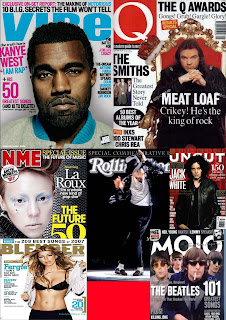

This magazine, Rolling Stone, is a rock music magazine. i have chosen to analyze this front cover as it is very different to the other magazine covers that I have looked at. This front cover has an overall vintage look, which gives a new look to the music magazine industry. This cover used an image in sepia rather than in full colour. Behind this image is a fire image, and a white background is used. The main title "Rolling Stone" is overlapped by a pig image and a text box:"New clues to JFK's murder". This is an interesting use of design, and makes this magazine stand out amongst the others.

Magazines usually have a target audience. Of course, they would like to sell to as many people as possible, but since no magazine can be all things to all people, they will usually target a group large enough to make a profit, but specific enough to be distinctive. (No one wants another LIFE magazine; that niche is already filled.
To catergorise the target audience you would look at the following :
-the education level required to read the articles
-the hobbies or interests of the audience
- the political slant (conservative or liberal)
-the economic class of the reader
-the products advertised
-the depth of the articles (superficial, in-depth)
-the level of vocabulary
-the tone (lighthearted, serious)
The image below are various succesfull magazines in the publication industry.You can tell they all represent different genres mainly by style,colour and the artists viewed on the front cover.

This magazine, Rolling Stone, is a rock music magazine. i have chosen to analyze this front cover as it is very different to the other magazine covers that I have looked at. This front cover has an overall vintage look, which gives a new look to the music magazine industry. This cover used an image in sepia rather than in full colour. Behind this image is a fire image, and a white background is used. The main title "Rolling Stone" is overlapped by a pig image and a text box:"New clues to JFK's murder". This is an interesting use of design, and makes this magazine stand out amongst the others.
Kerrang is a magazine in the niche market.I would say the magazine is aimed at both men and women ,but it is mainly aimed at men more.I can tell this because as you look to the front cover on the left , it is dominated with pictures of men.The magazine is very visual and packed with information for the reader.The logo is simple and bold, with detail on the text , the layout of this magazine is simplistic .

The masthead is bold and is the u.s.p of the magazine it is iconic , probaly the reason why it is so succesfull.Even though you cant see it on this front cover normaly NME uses circles for competitions used in the magazine ,this is to attract the consumer.NME and Kerrang use similar layout in the fact that they use big bold text for their features and keep the page as simple as possible.
Thursday 28 January 2010
Final photoshoot


To produce my final photo shoot i used a digital s.l.r camera and mounted it on a tripod to makes sure my image was in focus and not blurry.For the lighting my friend and i uses lamps to point light where was wanted it ,to create shadows around him for the photoshoot.As you will see on some of the photos the background colour is blue on some of them, these are just images copied from the original and edited on lightroom 3 .By changing the originals it made the image viewed in a different way .The image will be viewed in a different way because by changing them from yellow to blue could represent the mood of the photo, yellow being happy blue being sad.
Front cover development


The next two stages were picking in the design where to set the text on the page ( what looked good ).I first chose to just use black and white and different text for contrast.

 overall i like the idea but i don't feel the spacing has been used to its best potential and looking at it i don't think the text links (the text looks out of place) .I also think the heading font does not fit with the magazine image (indie) looks like font for a magazine with the genre of drum and base or dubstep.
Subscribe to:
Posts (Atom)