MAGAZINE ANALYSIS
Magazines usually have a target audience. Of course, they would like to sell to as many people as possible, but since no magazine can be all things to all people, they will usually target a group large enough to make a profit, but specific enough to be distinctive. (No one wants another LIFE magazine; that niche is already filled.
To catergorise the target audience you would look at the following :
-the education level required to read the articles
-the hobbies or interests of the audience
- the political slant (conservative or liberal)
-the economic class of the reader
-the products advertised
-the depth of the articles (superficial, in-depth)
-the level of vocabulary
-the tone (lighthearted, serious)
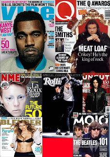
The image below are various succesfull magazines in the publication industry.You can tell they all represent different genres mainly by style,colour and the artists viewed on the front cover.
 This magazine, Rolling Stone, is a rock music magazine. i have chosen to analyze this front cover as it is very different to the other magazine covers that I have looked at. This front cover has an overall vintage look, which gives a new look to the music magazine industry. This cover used an image in sepia rather than in full colour. Behind this image is a fire image, and a white background is used. The main title "Rolling Stone" is overlapped by a pig image and a text box:"New clues to JFK's murder". This is an interesting use of design, and makes this magazine stand out amongst the others.
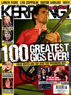
Kerrang is a magazine in the niche market.I would say the magazine is aimed at both men and women ,but it is mainly aimed at men more.I can tell this because as you look to the front cover on the left , it is dominated with pictures of men.The magazine is very visual and packed with information for the reader.The logo is simple and bold, with detail on the text , the layout of this magazine is simplistic .
The masthead is bold and is the u.s.p of the magazine it is iconic , probaly the reason why it is so succesfull.Even though you cant see it on this front cover normaly NME uses circles for competitions used in the magazine ,this is to attract the consumer.NME and Kerrang use similar layout in the fact that they use big bold text for their features and keep the page as simple as possible.


 I am very happy with the final result of my magazine .I am confident that if a consumer walked pass a magazine stall this magazine would attract attention without fail because the dominant colour is red.I also enjoyed adding the eye to jacks hand i wanted this to show a split personality.


